
Designing a grocery shopping app
Project Overview
The main objective of this project was to design an online grocery shopping app for a fictional grocery store called GoodMarket. Interaction design was the focus of this project, and I created the conceptual models through creating low-fidelity wireframes and design patterns.
My Role: Interaction Designer
Deliverables: Competitive analysis, site maps, user flows, wireframes, design patterns
Timing: 1 month in 2017
Target audience: Busy professionals, age 25-40, lives alone, works long hours
Goals
To begin, I mapped out the needs of the business and the users—identifying areas of overlap.

Competitive Analysis
I got to know some competitors in the space, used their products, and sketched out some of the flows to get a better feel for design choices.

Usability competitive analysis
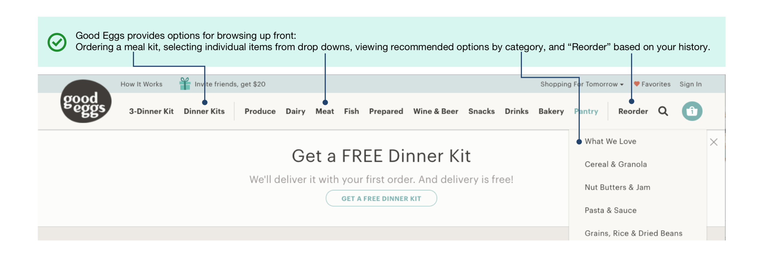
A deep dive on a competitor in the space, GoodEggs revealed good and bad examples of usability. I broke down my observations into learnability, efficiency, memorability, errors, and satisfaction, noting what I liked.
Learnability

Efficiency

Memorability
errors

Satisfaction
The overall Good Eggs experience feels cohesive, beautiful, easy to use, and inspiring. I like the combination of browsing by “aisle”, and by meal plan, and by recent order history. My least favorite experiences were not being able to easily navigate to the home page, and the fact that I decided I wanted to order a meal kit but it wouldn’t be ready that day. If there had been a physical store where I could have picked up the meal kit, I would have liked that option.
Card sorting
A card sort with three potential customers helped me identify the type of groupings I wanted to use for the information architecture to organize GoodMarket's most popular items. It helped me determine user's conceptual models of different categories of information on my site.
Sitemap and User flows
I used the findings from my card sort to inform a sitemap. I knew that I wanted customers to be able to search both by traditional grocery aisle and by meal organization—so that I could tailor the experience to customers with varying needs.
I wanted the user flow to clearly explain the loops available to a customer associated both with browsing and adding items to a cart, and with the check-out process.


Wireframes
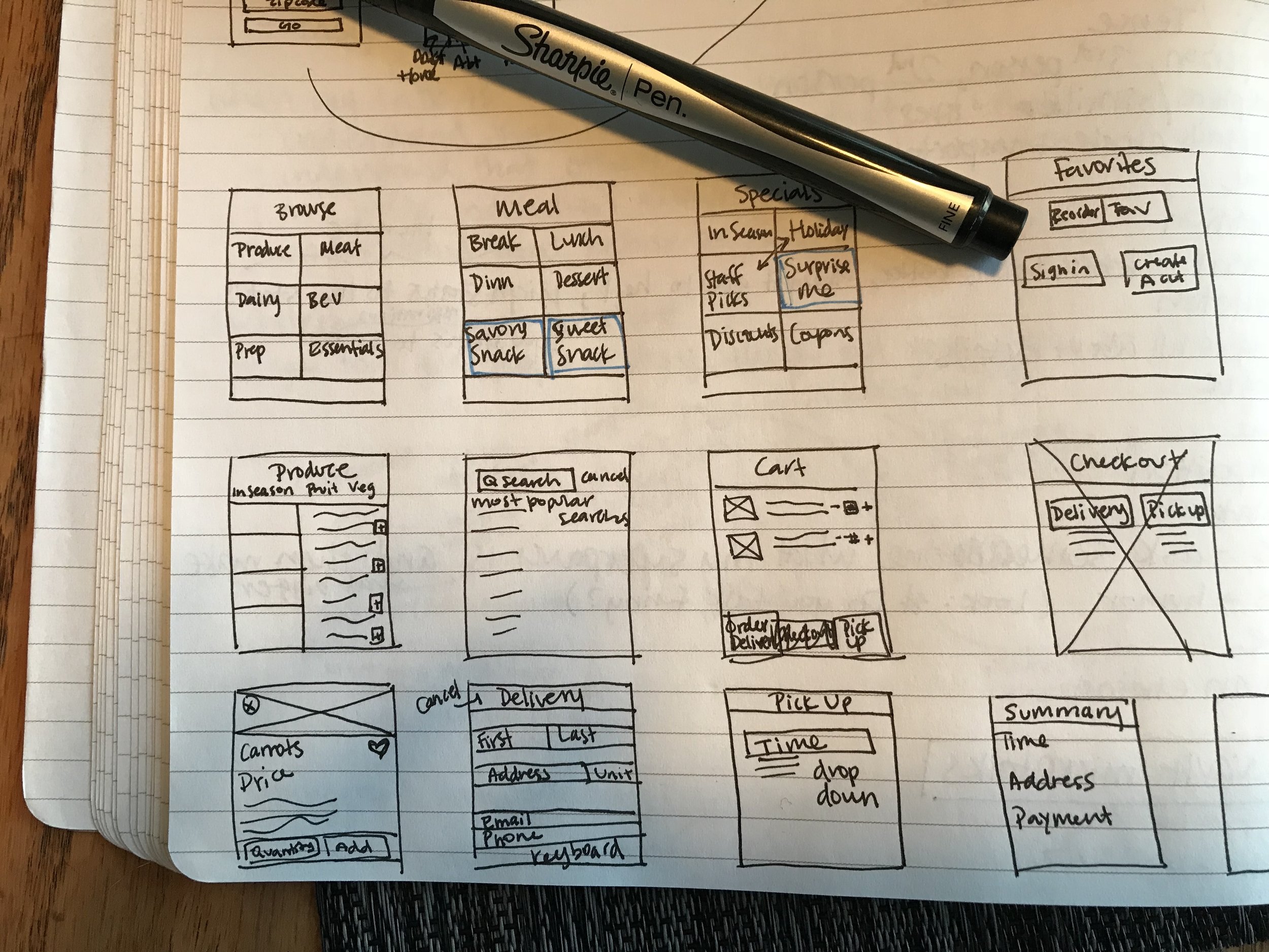
I moved on to low-fidelity wireframing, first sketching by hand and then using UXPin to digitize the frames and add the customer flow. I made the decision to incorporate two options for check-out: delivery and pick-up. My reasoning here was that occasionally customers need their food before a delivery window is available. Therefore, GoodMarket could take advantage of the fact that they also have a brick-and-mortar store and could assemble the groceries for a customer to pick them up. A customer could get their groceries when they need them, while saving time by not doing the shopping themselves, and GoodMarket retains the customer.
Design patterns
I used some common design patterns in my screens and navigation, using both form and navigation patterns, explained below to clearly articulate a user's actions and options.
Form patterns
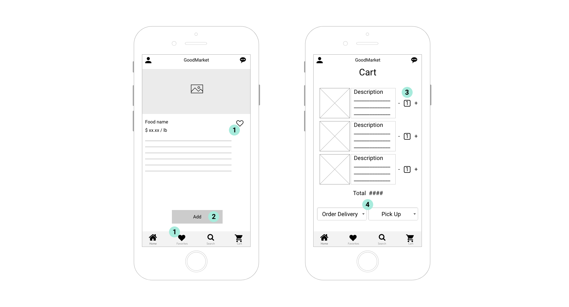
1. Heart icon. Each product page will have a heart icon that will start as an outline. A customer can save the product to a list of favorites by clicking the icon, which fills it in. It will remain filled during future visits while signed in. The heart icon will also appear in the bottom apps bar as a menu item. This one will be filled in, and once clicked, will open a screen with favorited items.
2. Add button. The add button will be on each product page, and will enable a customer to add a product to her cart. The product page will have more information about the product details that a customer can scroll through, though the add button will remain locked in place so at any point while reading, the customer can choose to easily add the product to her cart.
3. Quantity selector. When a customer views her cart, she'll see a screen that lists all added products. To the right of the brief product description will be a number in a box, representing the number of that item added to the cart. Plus and minus signs will flank the box, enabling the customer to increase or decrease the desired quantity without navigating to a different screen.
4. Drop downs. The bottom of the cart page will have two drop downs to schedule delivery or pick-up. Each drop down will list the available dates and times for that option, thus customers can easily see which time window best matches their needs and schedule.
Navigation patterns

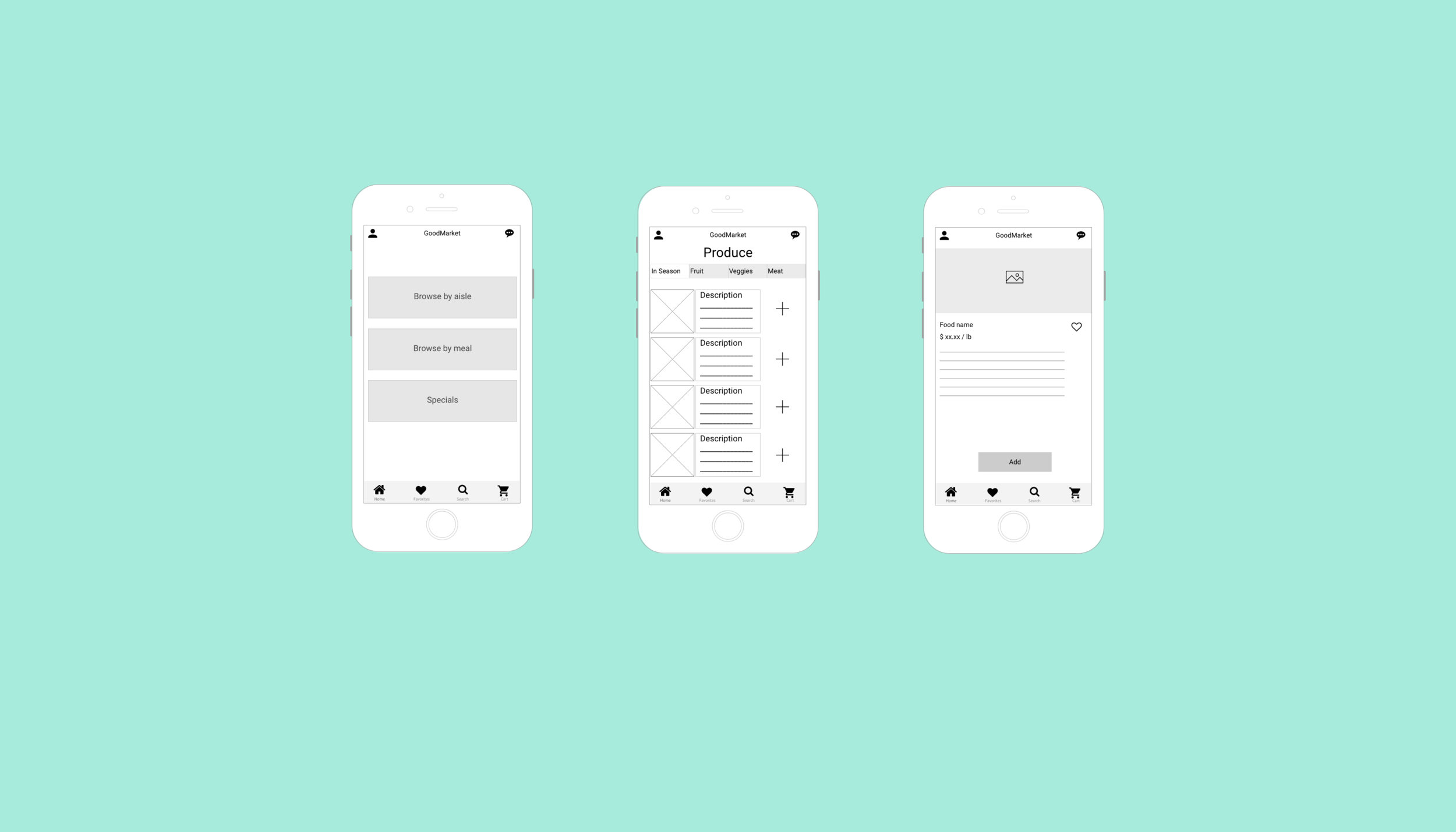
5. Primary navigation. GoodMarket's navigation structure begins with a screen that prompts a customer to browse by traditional grocery store aisle, but curated meal, or by specials. By clicking on each of the large gray boxes on the first screen, the customer is brought to a new screen with subcategories, as shown in the second screen with options for grocery aisles.
6. Secondary navigation. Once a customer navigates to subcategory menu, such as "Produce", they'll see another navigation scheme at the top, which breaks that category down further through a top navigation scroll bar. The selected sub-category will show up as a different color from the non-selected sub-categories. Products will populate in a scrolling menu downward within the selected category at the top. Each product will have a photo, title, short description, and the option to add the item to the cart. Customers can also click to get further details.
7. Back. To return back to the prior screens, a customer will click on the back arrow at the top of the screens. Alternatively, a customer can click on the Home button in the bottom App bar to take them back to the primary navigation.
Lessons learned
This project allowed me to practice organizing information and conceptualizing user flows and interactions. Within the designs, I considered the business strategy of incorporating core competencies and assets of GoodMarket—the fact that they have a brick-and-mortar store—into how a user can order groceries to meet their needs of fast and convenient shopping.
If I had more time, I would continue to build out high-fidelity mockups and test the flows with users, observing how they interacted with my navigation scheme.